• Postmodernism
• Birth of pop
• Wes Wilson
• Victor Moscoso
• New way of typography
• Computer as a design tool
• William Kuntz
• Rosmiare Tissi
• April Grieman
• Paula Scher
• Herbert Matter
• Musical typographic of the 80’s
• Jacques Derrida
• Ed Fella
• David Carson
• Tibor Kalman
• Post-structuralism
• The 90’s
Today we learn about post-modernism and all the techniques that were used in this time from the 60's to the 90's and the present day. The postmodernism started after the vietnam war, and also after this war there was a break between studies and college, people didn't had money to pay for college.
TV and media you see the birth of pop, developed a culture, the tool changes us and we change the tool.
The 60’s were the roots of the postmodernism, a new pluralism emerged, music style, Wes Wilson and Victor Moscoso created the experimental alternative publishing.
The beetles in their yellow submarine lift the pushpin monthly graphic design.
New way of typography approach widely imitated in practice and education forming a new approach to typography in the late 70’s and early 80’s.The west was more receipted to the new typographic designs than the east coast because of the culture.
For the first time computer is used as the typographer and make designs, Wide letter spacing, bold straight lines punctuating space diagonal type, maxing typefaces or weight changes within words type reversed from a series of bars.
William Kuntz, New Wave typography, in the Swiss style but expanded.
Rosmiare Tissi, The idea of playfulness is the hallmark of her design.
April Grieman, New wave basel Studio in LA took ideas, early days of the computer, first with the paint boxes and later with the first Machintoshs.
History of art and design become a vast archive to be quoted appropriated and reused.
Underground music, the musical typographic of the 80’s Postmodernism does not comprise a single unified style– but a conspicuous group of trends– retro, punk, grunge, beach, techno, parody, and pastiche.
Jacques Derrida, called the study of writing Grammatology- writing was a distinctive mode of representation.
The 90’s a rethinking of the ways order can be achieved, fragmentation and the electronic media.
The role of the graphic designer will be seriously challenged in the 21st century, designers will need to have something to contribute other than basic production skills. Designers no longer work with stable flat compositions but instead conceived of graphic systems that coordinate multiple back-stage tasks.
Wednesday, April 14, 2010
Sunday, April 11, 2010
Discourse 2
• Teacher at the Bauhaus
• Self-Taught
• Hungarian
• Designed a number of publications
• Typographic form
• "elasticity"
• Typography is a tool of communication.
• absolute clarity
• photographic form
• intellectual relationship
• priority
• clarity
• legibility
• letters may be forced into a preconceived framework.
• contemporary typography
• zincographic techniques
• hieroglyphs
• personal imagination
• photography
• replacement of literature by film
• letter writing obsolete
• intricate
• costly
• simple and available
• typographical image
• making of posters
• photography had replaced poster-painting
• camera
• photographic techniques
• enlargement of posters
• new typefaces
• brilliant color effects
• intensity of the message
• vision and communication

I chose this image to show how typography can be used differently. You can clearly read what each section says, I like how typography is treated in this design, even though more than one typeface is used it doesn't look busy or is not hard to read.The typography is placed in a way that gives an Old West texture and feeling, plays with hierarchy very well and that's what makes this poster interesting to look at.

I then chose the How to Train Your Dragon movie poster because in the article they talked about movie posters and how they wont be hand painted any more. This poster is clearly not hand painted, and the type is 3d also. This is very very different form something Moholy-Nagy was used to. Typography these days is pushed to the limits. We have 3d type, comp type, and hand drawn the list can go on forever. Movie posters theses days dont just rely on images its also all about the type, and what message the type is bringing to the viewer.

I like how they made type out of wood to be used as furniture. Back when the Bauhaus was around they did make handmade type but nothing to this extent, times are a changing. This is something you would have never seen, they were just starting to form alot of type faces. I can totally see my self buying a decoration piece like this for my house, it's a very interesting design, simple but has this clean design that makes it powerful.
• Self-Taught
• Hungarian
• Designed a number of publications
• Typographic form
• "elasticity"
• Typography is a tool of communication.
• absolute clarity
• photographic form
• intellectual relationship
• priority
• clarity
• legibility
• letters may be forced into a preconceived framework.
• contemporary typography
• zincographic techniques
• hieroglyphs
• personal imagination
• photography
• replacement of literature by film
• letter writing obsolete
• intricate
• costly
• simple and available
• typographical image
• making of posters
• photography had replaced poster-painting
• camera
• photographic techniques
• enlargement of posters
• new typefaces
• brilliant color effects
• intensity of the message
• vision and communication

I chose this image to show how typography can be used differently. You can clearly read what each section says, I like how typography is treated in this design, even though more than one typeface is used it doesn't look busy or is not hard to read.The typography is placed in a way that gives an Old West texture and feeling, plays with hierarchy very well and that's what makes this poster interesting to look at.
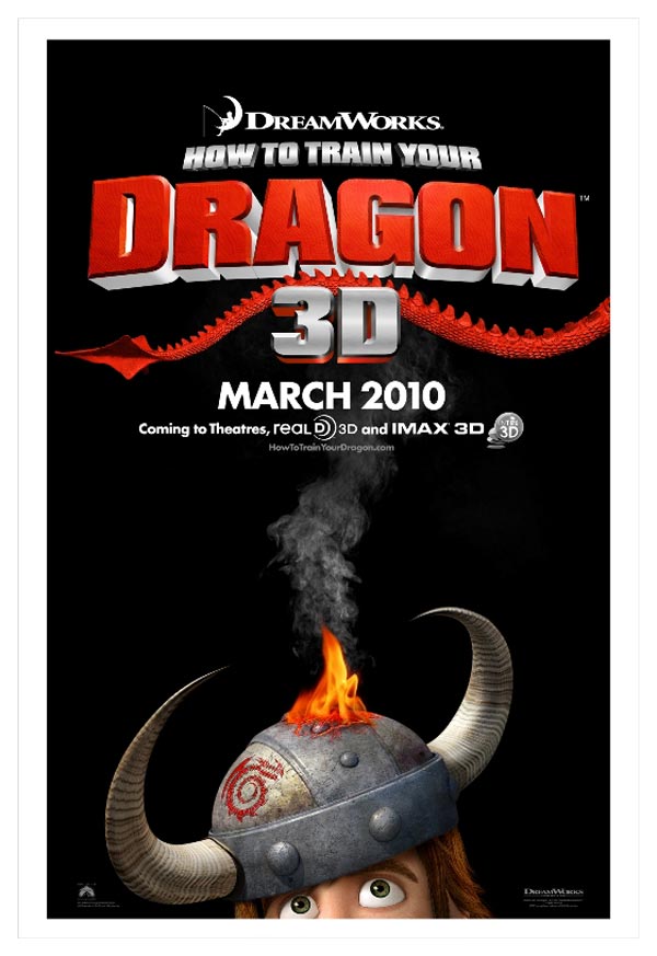
I then chose the How to Train Your Dragon movie poster because in the article they talked about movie posters and how they wont be hand painted any more. This poster is clearly not hand painted, and the type is 3d also. This is very very different form something Moholy-Nagy was used to. Typography these days is pushed to the limits. We have 3d type, comp type, and hand drawn the list can go on forever. Movie posters theses days dont just rely on images its also all about the type, and what message the type is bringing to the viewer.

I like how they made type out of wood to be used as furniture. Back when the Bauhaus was around they did make handmade type but nothing to this extent, times are a changing. This is something you would have never seen, they were just starting to form alot of type faces. I can totally see my self buying a decoration piece like this for my house, it's a very interesting design, simple but has this clean design that makes it powerful.
Wednesday, April 7, 2010
Apr. 7, 2010
•Armin Hoffman
•Josef Muller Brockman
•Swiss Design
•Visual counterpart to structural harmony of music
•Swiss movement merges with American Graphic Design
•Corporate Graphics
•Paul Rand
•Bradbury Thompson
•The NY School
•Chermayeff & Geismar Associates
•Unigrid System & Vignelli Associates
•Henry Wolf
•George Lois
•New Advertising
•Photo-Typography
•Lubalin
We learned about the beginnings of modern corporate graphics and advertising in America. This happened around the union of American design and Swiss design. This union brings new grid systems and new use of typography. Design starts to be about creating persona for companies, selling products and ideas.
Advertising had little use during this period it was more photography. George Lois made changes in the editorial pages and make it more racier in advertising. With this changes things were more simple and were focused on the content and product which was very powerful.
Wednesday, March 31, 2010
Mar. 31, 2010
• Early constructivism
• ISOTYPE
• Ladilav Sutnar
• Modernism and NY School
• Paul Randi
• Alexey Brodovitch
• Editorial design
• Black and white images
• Claude Shannon
• School at ULM
• Theo Ballmer and Max Bill
• early formal vocabulary
• Anton Stankowski
Early constructivism, Universal visual communication without text.
ISOTYPE (International System of Typographic Picture Education)
Ladislav Sutnar
It was familiar iconography from early Plakastil and propaganda posers. Information designers had the power to shape public opinion.
Designers align with the notion of engineering objective rational systematic.
Design system becomes a pervasive metaphor for design.
Idea of eye controlling for structuring text and image as logical information patterns.
The flight from Hitler and Fascism created the greatest transitional migration of intellectual and creative talent in history.
Images cast off neutrality, traditionalism, and provincialism and an embracing of the modern world.
American design was reflected in its culture egalitarian with capitalistic attitudes and values.
Small groups approached American design to modernist design of European models.
Plakastil simple image simple type.
Early voice in proposing the essence of modernist theories un visual communication.
Editorial design and the NY School 30’s and 40’s.
Commissioned major European artist and designer to produce work for editorial design.
Black and white images started to appear on editorial design.
He modeled the problem in terms of Data Signal Processing and thus heralded the coming of the information age.
Developed a curriculum that addresses new needs of this age.
Established its early formal vocabulary based on a rationalist model.
• Linear division of space into harmonious parts
• Modular grids
• Mathematical and geometric progressions, permutations, and sequences.
• Reliance on visual compensation to equalize contrasting complementary relationships.
Major contribution creation of visual forms to communicate invisible processes and physical forces.
Helvetica
This type ace was created to improve readability from a far distance on any medium and any size, this typeface was revolutionary for the United States commercial design, now days this typeface has become very popular and its used in almost everything, signs, posters and books are just a few examples where this typeface appears.
Helvetica is a strong and clean typeface that makes designs look clean, powerful and this is one of the reasons designers use it so much.
Wednesday, March 17, 2010
McLuhan's Wake - Automobile Technology
1. What human trait or experience does the medium enhance?
You begin with so little to survive just your scenses, your ayes collecting details.
What is the intended function of the medium or technology?
To facilitate the way humans move around.
What does it improve or make more efficient?
Improves the time of travel between places.
Does it extend part of the human body?
The steering wheel is an extension of the arms that guide the automobile and the feet because it allows you to move faster.
One or more of the senses?
Visual senses, sense of touch.
Does it extend an aspect of the human mind, such as memory?
No.
Does it amplify some human capability or augment some form of human action?
Amplifies the human capability to move faster and travel bigger distance in less time.
Does it extend the individual, the group or society?
2. What pre-existing technology, method, system, or medium does this medium obsolesce?
The use of a float and a horses.
What older technology does the new medium replace?
The use of a float and a horses.
What does it render unnecessary?
Makes unnecessary walk for a long time to get to another location, or ride a bike.
What procedures does it short-circuit or bypass?
The procedures of travel and event transport objects to different locations.
What happens to the old medium that is rendered obsolescent?
Some of them disappear and others will just lose their popularity, humans won’t use then as often as the new technology.
Does it disappear entirely, become an art object, or find a new niche?
The automobiles and all transportation technologies have become an art object, you can look at cars as art objects.
3. What technology, method, system or medium that was previously obsolesced or abandoned does this medium retrieve?
Automobiles retrieves the technology of the wheel that has been around since its invention, cars where ones built out of wood and now they place wood as a luxury inside the car to make it look more fancy.
What archaic elements are made relevant again?
The use of a parking meter, they used to use a ring where the horses where tide up it was free but now days for cars we use parking meters to have a place to park the car.
What previously marginalized or repressed ideas, practices or artifacts are brought to the fore?
Yes, now days any idea is valid and previous ideas that people thought that never would work now humans are making them work, for example Da Vinci had the idea of a machine that could fly and now we have the airplane.
What aspects of the prehistoric, ancient, medieval or early modern world are revived?
Non, every aspect changes, every day its always new technology implemented.
It will reverse into an obsolete object and recycled to make new similar objects.
What effects will the medium create that are opposite to what was originally
intended?
It affects the environment, contamination and war.
What are the contradictions inherent in the technology?
The technology is being sold as a safe technology when is not 100% safe, an accident occur and people die.
What is the ecological impact?
Automobiles emit CO2, which has affected the ecology of the world. Has debilitated the ozone layer making poles melt and creating the global warming.
Automobiles have been an invention that had help humans grow in a lot of ways, for example cities have grown in a large extent, communication between places are more easy to accomplish. If you look at these aspects you will say that this technology has help humans to be more successful, but at the same time this success is turn into a problem when its out of the human’s ability to manage it. For example in the movie we watched about the technologies it mention how all these technologies have made humans alter their senses. Whit this have been said I relate stress with sickness, now days humans don’t have a healthy life anymore, not just because of the polluted environment we live now days but because of the high speed life we live now.
Wednesday, March 3, 2010
Mar. 3, 2010
- Dutch Modernism
- Paul Shoetema
- Rodehenko
- Optical dynamics
- German Plakastil
- Post Cubism and Art Deco- Edward Kauffer
- A.M Cassandre
- Jean Carlu
- Joseph Binder
- Art Deco modern
- E. McKnight Kauffer- Joseph Binder
- Ludwig Hohlwien
- Montgomery Flag
- Herbert Matter-
Between the wars Germany became cultural hub.
In Dutch Modernism the printing arts perform as an expressive tool means and methods of commercial reproduction become tools of creativity.
working with the image and where it takes and iconic role.
Photos had a power illustrationscould never convey.The use of collage technique with parts from the typecase became very popular.
Dutch Modernism partners with German Plakastil to define a modernist playbook for designing commerce and advertising.
Graphic design contributes to a culture of consumption modernism becomes a consumable idea popularized trough style trends.
The idea of motion and speed was invented, Tourism and entertainment industries flourish, exploring new degree of mobility.
Design of the 1930s become a common source of stylistic fantasies.
Art Deco modern mastered the graphic representation off industry and commerce their work prefigured branding in advertising.
Ludwig Hohlwien made the Olympic games become propaganda event for Nazi Germany. Evolution of his work coincided closely with Hitler’s concept of effective propaganda.
Hitler rejects the artistic in Plakatstil “Slogans and popular illustrations of Allies were more effective”.
Herbert Matter Understood Russian film innovations, the use of montage and collage.
Tuesday, March 2, 2010
Discourse 1
1992 American Gothic
Rick Poynor
• In Britain fate has overtaken the angular post constructivist type designs of Neville Brody, Zuzana Licko, and Max Kisman.
• These faces, once so urgently new, are judged less “contemporary” than san serif.
• In 1990 the critic Robert Hughes called “the shock of the new” to a typeface that evokes an authentic sense.
• Template Gothic designed by CalArts graduate Barry Deck.
• Tony Arefin, one of the first designers to use the typeface.
• Fontographer was the type design program used to create digitally the typeface.
• For now Template Gothic is one of the most interesting and original new faces we have.
 I chose this image because is shows the Template Gothic characters from uppercase letters to numbers and symbols. Like the article said this is one of the most interesting and successful new typefaces in 1990.
 I found this image of the Cornelia Parker exhibition catalogue designed by Tony Arefin in which he used the Template Gothic typeface for all the text in the catalogue. I think this typeface works really well, it’s easy to read, gives an interesting look and mood to the design.
 This image shows a screenshot of the Fontographer program, this program was used to create the digital version of the Template Gothic typeface. With this program the face embodies a post-modern narrative on the methods of character-generation it supersedes.
Wednesday, February 24, 2010
Feb. 24,2010
-Mondrian
-Architecture integrates graphic design.
-The Bauhaus
-Moholy Nagy
-Photoplastics
-Type photography
-prototypes design for industry
-Herbert Bayer
-Universal alphabet
-Universal set of rules for typography design
-Jan Tschichold
The most inspiration was the Mondrian’s drawings using verticals and horizontal lines for a visual force, Mondrian goes from painting cubist to a horizontal and vertical lines.
The same experimentations happening in the 2d were also happening in the 3d design.
Architectural and graphic design forms in asymmetrical equilibrium.
Many of these artist and designers ended up in New York to influence design there in the 50’s and 60’s.
The Bauhaus was inspiration of the early expressionism, medievalism, and handicraft.
Bauhaus comes from the word Bauhutte that was the name of the Gothic Cathedrals.
Moholy Nagy, comes up with new typography.
Photography experimentation.
“Photoplastics” expand role of photography in a design context.
Subdivition of the space, using heavy contrast between typefaces, geometric devices and color.
Herbert Bayer, painter. Developed a widely imitated recipe for a modernist page.
Modern abstract paintings with diagonal lines.
Primary visual weight the only color that gets near is black, there for we see a lot of black, red and white.
Wednesday, February 17, 2010
Feb. 17, 2010
-Russian suprematism
-Modern graphic design
-Merinetti's lectures
-Photography takes the lead
-Redefined concept of the artist as an Industrial worker
-Image revolution
-Drafting instruments
-Russian techniques
-Film becomes a new way to portrait
-Photomontage
-Formalization of design
-Rodehenko
-Film in a context of a book
-Packaging design
-Geometric abstraction
-Lissitzky
-Type becomes movement
-"ism"
-first book visual programed
-Movie poster design
The key point of this lecture that caught my attention was how film started to become a important part for design and how designers like Rodhenko, Dziga Vertov and the Steinberg Brothers used these techniques to create art.
I like how the Steinberg Brothers used film to create movie posters by re-projecting scenes of the movie, played with light and then print them out.
Another point that caught my attention is when Lissitzky brings the icon as a universal language, using geometric forms.
I really enjoyed todays lecture, Russian art is very powerful I can see my self using this kind of techniques in my own designs. The Dramatic images, high contrast, industrial fabrications, strong diagonals and close ups of people are pretty good forms to express art.
Wednesday, February 10, 2010
Feb. 10, 2010
- Plakastil
- Graphic Cubism
- Demoislles second Type style of cubism
- Hans Rudi Erdt
- Allied and Axis posters
- Montgomery Flag
- Germany became cultural hub
- Futurism and DADA
- Structuralism linguistics
- Lewis Carol
- Stephane Mallarme
- Gillaume Apollinaire
- Marinetti
- Surrealism
Plakastil started with Lucian Bernhard and brought the graphic simplicity and cubism,
after Lucian Bernhard, Demoislles came with the second type style of cubism.
When the First World War ended poster design came to an end and graphic design took a new role.
In 1901 Hans Rudi brought the birth of new trademark design, propaganda was used for visual communication.
During the war Allied and Axis powers used posters and kept the plakastil technique.
DADA is associated more to the political view, structuralism linguistics by Ferdinand, theses elements include the notion of the linguistic SIGN, the SIGNIFIER, the SIGNIFIED and the REFERENT, "The sign is empty and signs is arbitrary".
I like how Gillaume Apollinaire makes text play various roles on the page, Visual and Verbal. How the text moves around the page is really interesting.
In 1909 in order to free type Marinetti had to destroy its previews purpose and play more with different type sizes.
Its awesome how we can use Graphic design history to look back and bring all this techniques and graphic movements and apply them to our designs. it opens your mind and think how ancestors in graphic design evolved and how we can keep evolving with the same elements that have been around for decades.
Wednesday, January 27, 2010
Jan. 27, 2010
- Victorian Period
- middle class was created
- Book design
- Illustrating type
- Books were mass produced
- Gothic Victorian from
- Baseball cards were created
- Invention of chromolithography
- Chromolithography in USA- Luis Pran
- John Gamble - Automation of typographic
- Weekly magazine - First ad agency Volney Palmer
- William Morris - Japanese influence
- Recycling pre-existing historical models
- Ornaments becomes structure
- Symbolic and philosophic concerns
- Arts and Crafts movement
- Cheret and Grasset
- Jugendstil movement
- Van de Velde
- Viennese Style movement- Peter Beherns
Today we learned about how the art persuasion was born, it was born in the Victorian period with the expression of the middle class industrial era, and this is howe in this period the middle class was born. In this period book design became very important and made artist to start illustrating typography. The commercial evolution started with all these developments, books started to be mass produced, editorial design was born, baseball cards were created.
It's interesting that in that time Godefroy came with the idea of creating the chromolithography since photography was not invented yet.
What capture my attention was that by 1827 lithographic press was able to print out 4,000 impressions per hour.
With all this inventions John Gamble in 1801 patented a machine to make paper in single sheet form. By 1886 Ottmar created a machine named "monotype" to automatize printed type.
With all these other inventions marketing and publishing started to evolve and other type of publications started to appear such as weekly magazines with illustrations and political cartooning.
what is really interesting is that not just here in the US all these evolutions were happening, also in Germany, Japan and other countries.
In Germany the jugendstil appear in 1890 – 1910, this style was the equivalent to the art Nouveau.
Japanese influences became a big influence as well in all the typographic and illustration design.
I like how all these influences and technologies are still being used now days, maybe in a different way and better developed but at the end is the same technic.
Wednesday, January 20, 2010
Jan. 20, 2010
-Graphic Design concepts from the prehistoric art
-The Invention of written Revolution
-Invention of flexible materials to print type
-Chinese technology and contribution to writing
-Greeks experimentation on reading experience
-Invention of Serif Roman form
-Basic four strokes that construct the alphabet
-CODAX Christian Book
-German contribution to writing and typographic design.
-The first type printed bye Gutenberg
-Poliphili's creation of italic
-On 1705 type was being ready to be printed by machines
-Jon Baskerville contribution to type printing
-The six categories of serifs
It was interesting to learn how since the prehistoric times humans invented a way to express what they were feeling, even just by drawing symbols that had forms and counter forms.
Then human started to find ways and new technics to make the symbols more easy to read and faster to be drawn. I like the fact the Chinese even though they where on the oriental part of the world, didn't had any relation with the european side where all this technics and inventions where occurring they invented their own symbols and technics to communicate.
The fact that now days we use the same technic and we keep adding new design elements to typography and how to plan a book make me think on the future and how typography is going to be design. its going to keep evolving?
Subscribe to:
Posts (Atom)
