• Postmodernism
• Birth of pop
• Wes Wilson
• Victor Moscoso
• New way of typography
• Computer as a design tool
• William Kuntz
• Rosmiare Tissi
• April Grieman
• Paula Scher
• Herbert Matter
• Musical typographic of the 80’s
• Jacques Derrida
• Ed Fella
• David Carson
• Tibor Kalman
• Post-structuralism
• The 90’s
Today we learn about post-modernism and all the techniques that were used in this time from the 60's to the 90's and the present day. The postmodernism started after the vietnam war, and also after this war there was a break between studies and college, people didn't had money to pay for college.
TV and media you see the birth of pop, developed a culture, the tool changes us and we change the tool.
The 60’s were the roots of the postmodernism, a new pluralism emerged, music style, Wes Wilson and Victor Moscoso created the experimental alternative publishing.
The beetles in their yellow submarine lift the pushpin monthly graphic design.
New way of typography approach widely imitated in practice and education forming a new approach to typography in the late 70’s and early 80’s.The west was more receipted to the new typographic designs than the east coast because of the culture.
For the first time computer is used as the typographer and make designs, Wide letter spacing, bold straight lines punctuating space diagonal type, maxing typefaces or weight changes within words type reversed from a series of bars.
William Kuntz, New Wave typography, in the Swiss style but expanded.
Rosmiare Tissi, The idea of playfulness is the hallmark of her design.
April Grieman, New wave basel Studio in LA took ideas, early days of the computer, first with the paint boxes and later with the first Machintoshs.
History of art and design become a vast archive to be quoted appropriated and reused.
Underground music, the musical typographic of the 80’s Postmodernism does not comprise a single unified style– but a conspicuous group of trends– retro, punk, grunge, beach, techno, parody, and pastiche.
Jacques Derrida, called the study of writing Grammatology- writing was a distinctive mode of representation.
The 90’s a rethinking of the ways order can be achieved, fragmentation and the electronic media.
The role of the graphic designer will be seriously challenged in the 21st century, designers will need to have something to contribute other than basic production skills. Designers no longer work with stable flat compositions but instead conceived of graphic systems that coordinate multiple back-stage tasks.
Wednesday, April 14, 2010
Sunday, April 11, 2010
Discourse 2
• Teacher at the Bauhaus
• Self-Taught
• Hungarian
• Designed a number of publications
• Typographic form
• "elasticity"
• Typography is a tool of communication.
• absolute clarity
• photographic form
• intellectual relationship
• priority
• clarity
• legibility
• letters may be forced into a preconceived framework.
• contemporary typography
• zincographic techniques
• hieroglyphs
• personal imagination
• photography
• replacement of literature by film
• letter writing obsolete
• intricate
• costly
• simple and available
• typographical image
• making of posters
• photography had replaced poster-painting
• camera
• photographic techniques
• enlargement of posters
• new typefaces
• brilliant color effects
• intensity of the message
• vision and communication

I chose this image to show how typography can be used differently. You can clearly read what each section says, I like how typography is treated in this design, even though more than one typeface is used it doesn't look busy or is not hard to read.The typography is placed in a way that gives an Old West texture and feeling, plays with hierarchy very well and that's what makes this poster interesting to look at.

I then chose the How to Train Your Dragon movie poster because in the article they talked about movie posters and how they wont be hand painted any more. This poster is clearly not hand painted, and the type is 3d also. This is very very different form something Moholy-Nagy was used to. Typography these days is pushed to the limits. We have 3d type, comp type, and hand drawn the list can go on forever. Movie posters theses days dont just rely on images its also all about the type, and what message the type is bringing to the viewer.

I like how they made type out of wood to be used as furniture. Back when the Bauhaus was around they did make handmade type but nothing to this extent, times are a changing. This is something you would have never seen, they were just starting to form alot of type faces. I can totally see my self buying a decoration piece like this for my house, it's a very interesting design, simple but has this clean design that makes it powerful.
• Self-Taught
• Hungarian
• Designed a number of publications
• Typographic form
• "elasticity"
• Typography is a tool of communication.
• absolute clarity
• photographic form
• intellectual relationship
• priority
• clarity
• legibility
• letters may be forced into a preconceived framework.
• contemporary typography
• zincographic techniques
• hieroglyphs
• personal imagination
• photography
• replacement of literature by film
• letter writing obsolete
• intricate
• costly
• simple and available
• typographical image
• making of posters
• photography had replaced poster-painting
• camera
• photographic techniques
• enlargement of posters
• new typefaces
• brilliant color effects
• intensity of the message
• vision and communication

I chose this image to show how typography can be used differently. You can clearly read what each section says, I like how typography is treated in this design, even though more than one typeface is used it doesn't look busy or is not hard to read.The typography is placed in a way that gives an Old West texture and feeling, plays with hierarchy very well and that's what makes this poster interesting to look at.
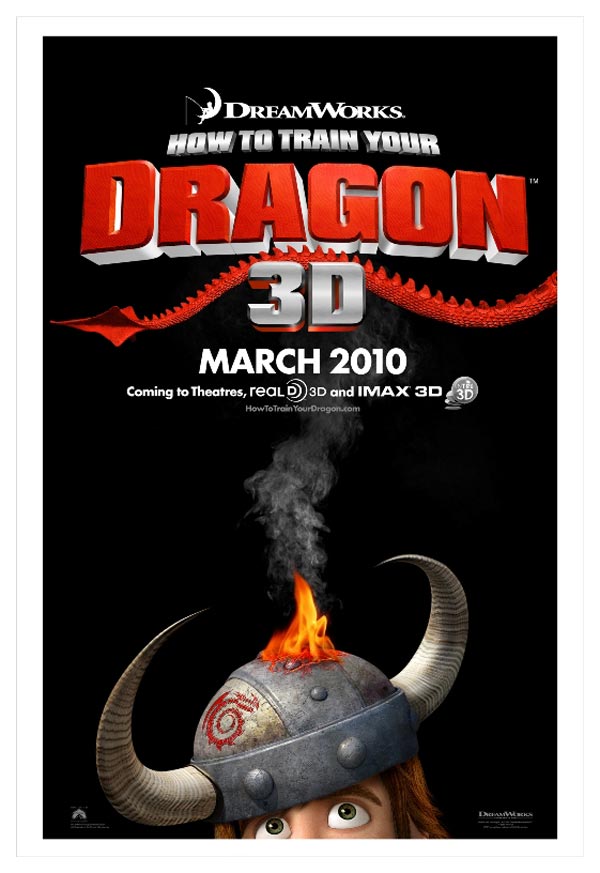
I then chose the How to Train Your Dragon movie poster because in the article they talked about movie posters and how they wont be hand painted any more. This poster is clearly not hand painted, and the type is 3d also. This is very very different form something Moholy-Nagy was used to. Typography these days is pushed to the limits. We have 3d type, comp type, and hand drawn the list can go on forever. Movie posters theses days dont just rely on images its also all about the type, and what message the type is bringing to the viewer.

I like how they made type out of wood to be used as furniture. Back when the Bauhaus was around they did make handmade type but nothing to this extent, times are a changing. This is something you would have never seen, they were just starting to form alot of type faces. I can totally see my self buying a decoration piece like this for my house, it's a very interesting design, simple but has this clean design that makes it powerful.
Wednesday, April 7, 2010
Apr. 7, 2010
•Armin Hoffman
•Josef Muller Brockman
•Swiss Design
•Visual counterpart to structural harmony of music
•Swiss movement merges with American Graphic Design
•Corporate Graphics
•Paul Rand
•Bradbury Thompson
•The NY School
•Chermayeff & Geismar Associates
•Unigrid System & Vignelli Associates
•Henry Wolf
•George Lois
•New Advertising
•Photo-Typography
•Lubalin
We learned about the beginnings of modern corporate graphics and advertising in America. This happened around the union of American design and Swiss design. This union brings new grid systems and new use of typography. Design starts to be about creating persona for companies, selling products and ideas.
Advertising had little use during this period it was more photography. George Lois made changes in the editorial pages and make it more racier in advertising. With this changes things were more simple and were focused on the content and product which was very powerful.
Subscribe to:
Posts (Atom)
